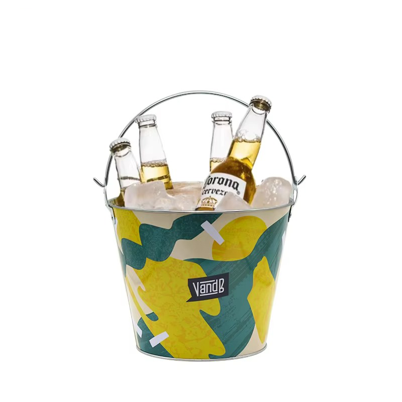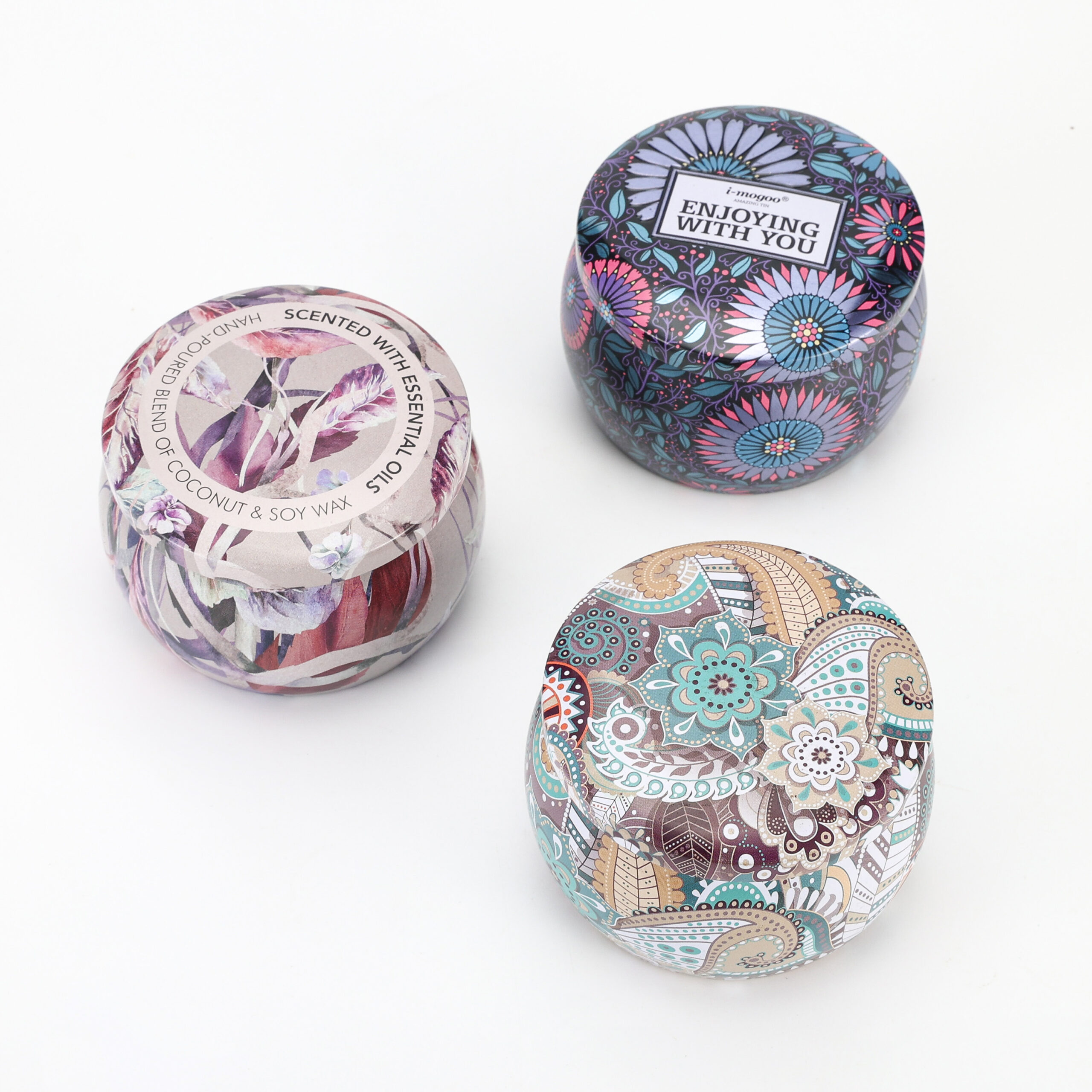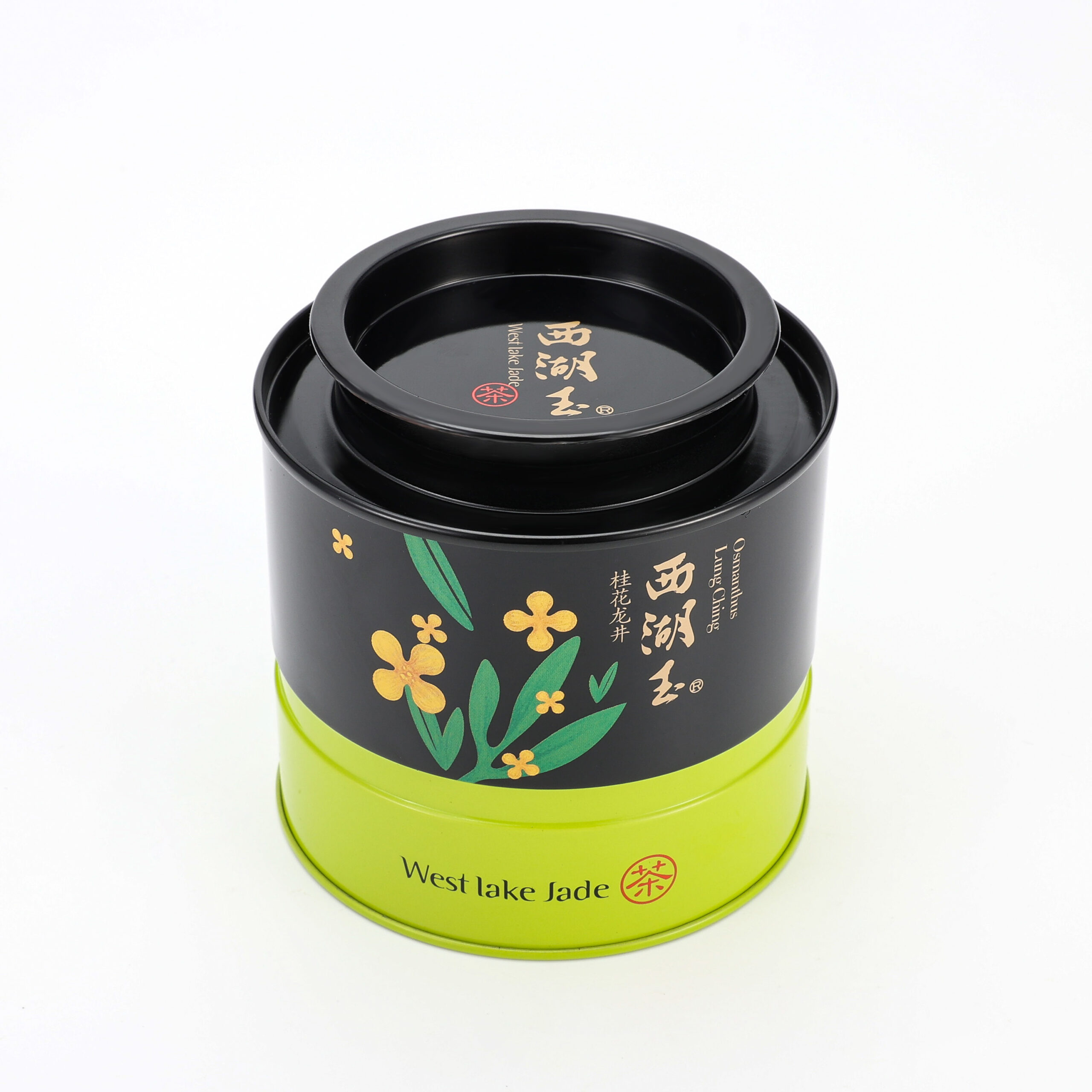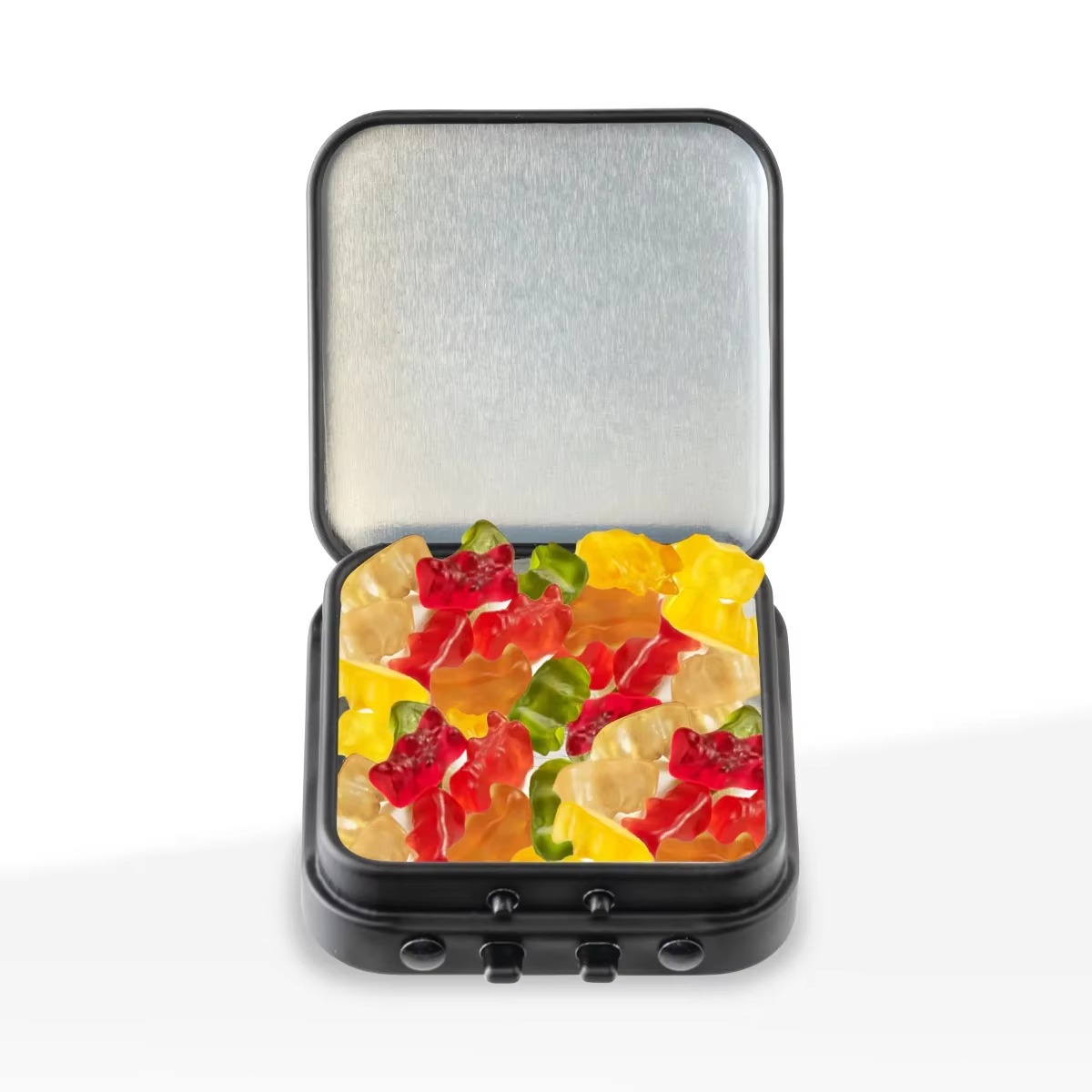
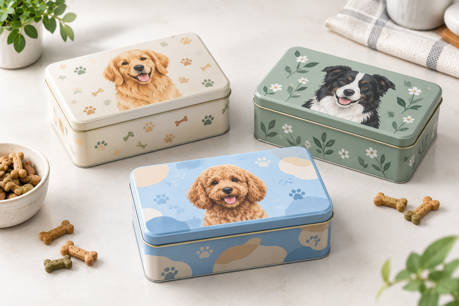
A custom dog treat tin is more than a metal container with a logo printed on the lid.
For pet brands, the tin can become part of the product identity. Its shape, artwork, colors, finish, and overall visual presentation can make the packaging recognizable before a customer even reads the product name.
But customization does not mean adding as many features as possible.
The better approach is to decide what should make your packaging recognizable, then choose the visual and physical customization options that support that goal.
If you are still deciding the technical requirements of the tin—such as size, internal space, lid structure, or insert requirements—start with our How to Choose a Dog Treat Tin: Size & Structure Guide.
This article focuses on what comes next: how to turn an approved tin structure into packaging that fits your brand.
What Makes a Custom Dog Treat Tin Feel Like Your Brand?
A recognizable package usually does not depend on one element alone.
Instead, several visual elements work together:
- Logo
- Brand colors
- Illustration or pattern
- Typography
- Product naming
- Tin shape
- Surface finish
- Overall layout
The key is consistency.
A pet brand may use a simple rectangular tin but create strong recognition through its illustration style and color system. Another brand may use a distinctive tin shape and keep the artwork relatively restrained.
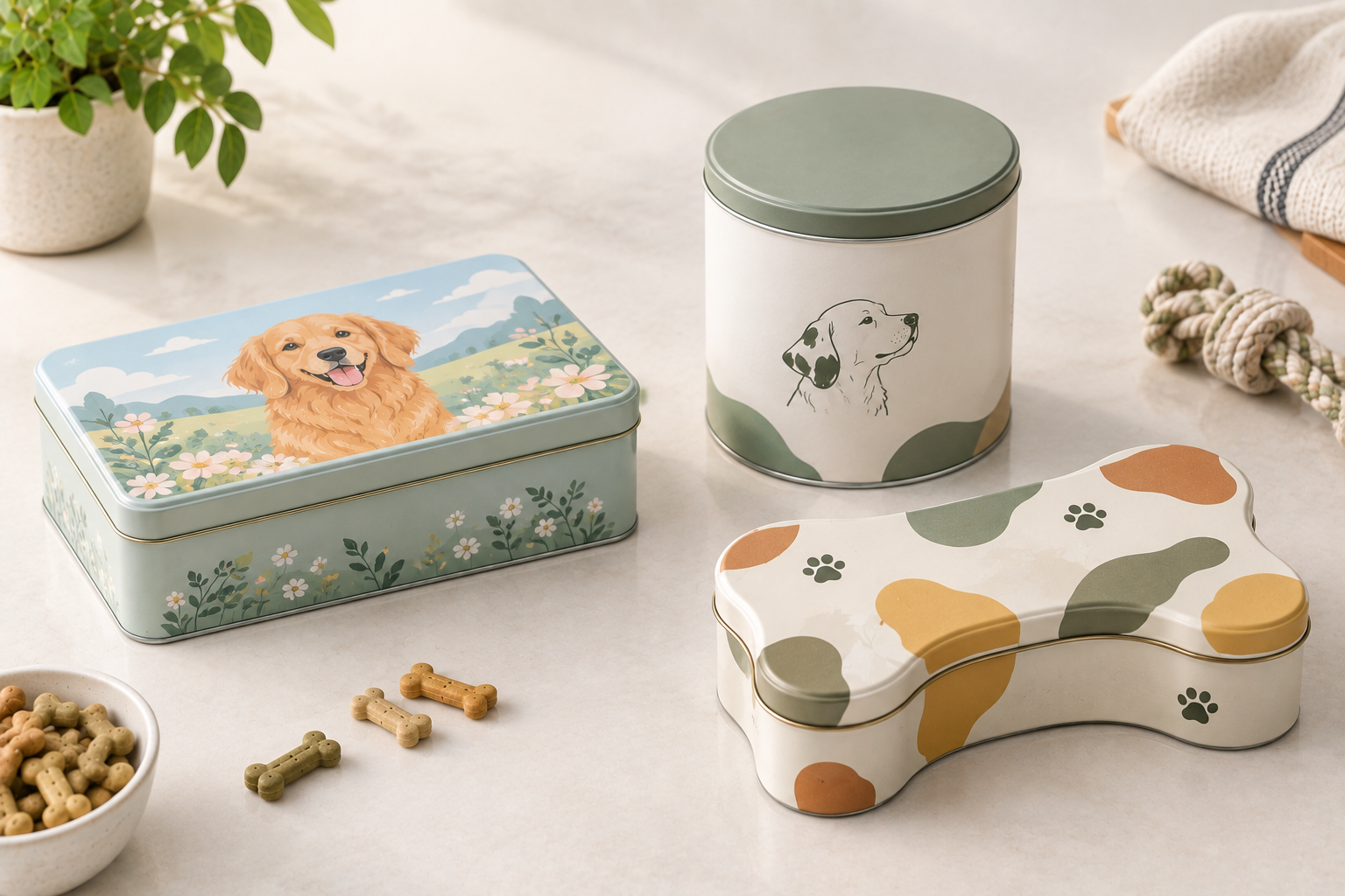
Neither approach needs to be complicated.
The question is:
If the logo were temporarily removed, would the packaging still look like it belongs to your brand?
That is a useful test when developing a personalized dog treat tin.
Your packaging should have a recognizable visual system rather than simply carrying a logo.
How Can the Tin Shape Support Your Brand Identity?
Shape is one of the few packaging elements that can contribute to brand recognition before the customer sees the artwork.
A standard rectangular or round tin can provide a clean foundation for branding. A more distinctive shape can create a stronger visual signature when the product concept calls for it.
But shape should not be chosen simply because it looks unusual.
The basic product-fit and structural decisions should already be handled separately. Once those requirements are established, you can consider how the selected shape supports the brand.
Ask:
- Does the shape fit the personality of the product?
- Does it provide enough useful artwork area?
- Does it look distinctive on a shelf or online product page?
- Does it fit with the brand’s existing packaging?
- Will the tin still look appropriate if customers reuse it?
This keeps the discussion about branding value, rather than repeating the technical size-selection process covered in the previous article.
How Should You Apply a Logo to a Dog Treat Tin?
The logo is usually one of the first things customers look for, but it does not need to dominate the entire package.
A strong design gives the logo enough visual space while allowing the product and supporting graphics to communicate what is inside.
A useful hierarchy is:
Brand → Product → Key Visual → Supporting Information
For example, the front of a dog treat tin may prioritize:
- Brand logo
- Product name
- Dog or treat illustration
- Flavor or variety
- Supporting product information
The exact hierarchy depends on the brand.
What matters is that customers can understand the package quickly without every element competing for attention.
How Do You Prepare Artwork for a Metal Tin?
Artwork for a tin should be developed with the physical package in mind.
A design that looks balanced on a computer screen can appear different once it is applied to metal surfaces with edges, corners, seams, and other structural transitions.
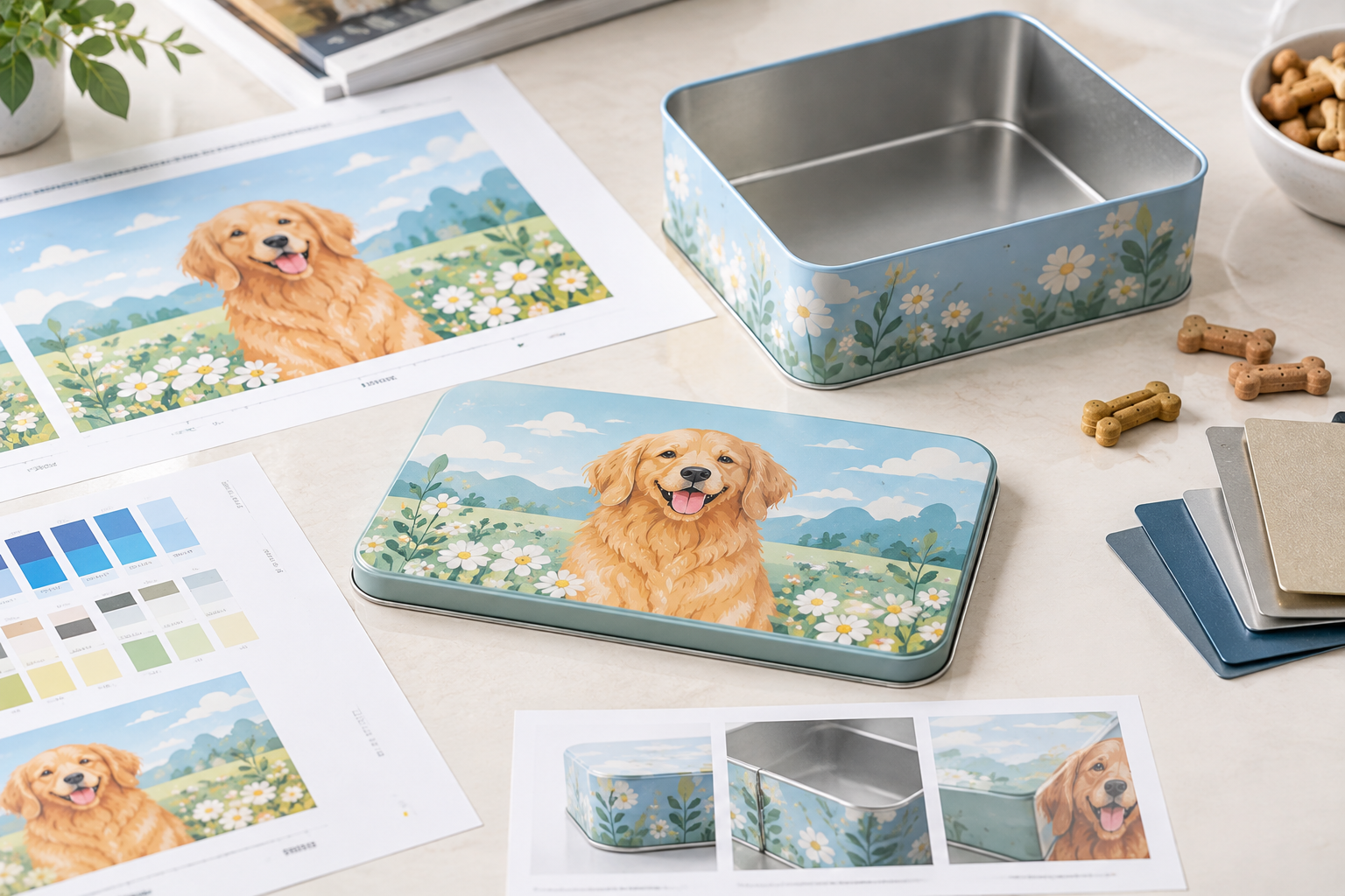
This is particularly important for:
- Logos
- Small text
- Fine illustrations
- Patterns
- Borders
- Important product information
Important visual elements should be positioned with the actual tin structure in mind.
That is why the recommended sequence is:
Approved Structure → Artwork Area → Artwork → Sample → Final Approval
Rather than:
Artwork → Find a Tin That Fits Later
This distinction can save unnecessary artwork revisions.
How Can Color Strengthen a Personalized Dog Treat Tin?
Color can become one of the strongest recognition elements in a packaging system.
For pet brands with multiple products, a consistent color strategy can help customers understand that different tins belong to the same product family.
For example, you might keep:
- The same logo treatment
- The same typography
- The same overall layout
while changing the dominant color to distinguish different treat varieties.
Another option is to keep the product colors consistent and use different illustrations or patterns to separate product lines.
The important thing is to establish the system before designing individual tins.
A custom dog treat tin should look like part of the brand—not like a completely separate design project every time a new product is launched.
How Does Surface Finish Affect the Brand Look?
The artwork is only part of the final appearance.
Surface finish can change how the same colors, graphics, and illustrations are perceived.
Depending on the brand direction, the package may need to feel:
- Clean and modern
- Premium and restrained
- Bright and playful
- Soft and approachable
- Bold and highly visible
The finish should support the artwork rather than compete with it.
For example, a detailed illustration may benefit from a visual treatment that keeps the artwork clear, while a minimalist design may rely more heavily on the relationship between color, space, and finish.
A useful way to evaluate this is to keep the basic tin structure consistent and compare different artwork and finish combinations.
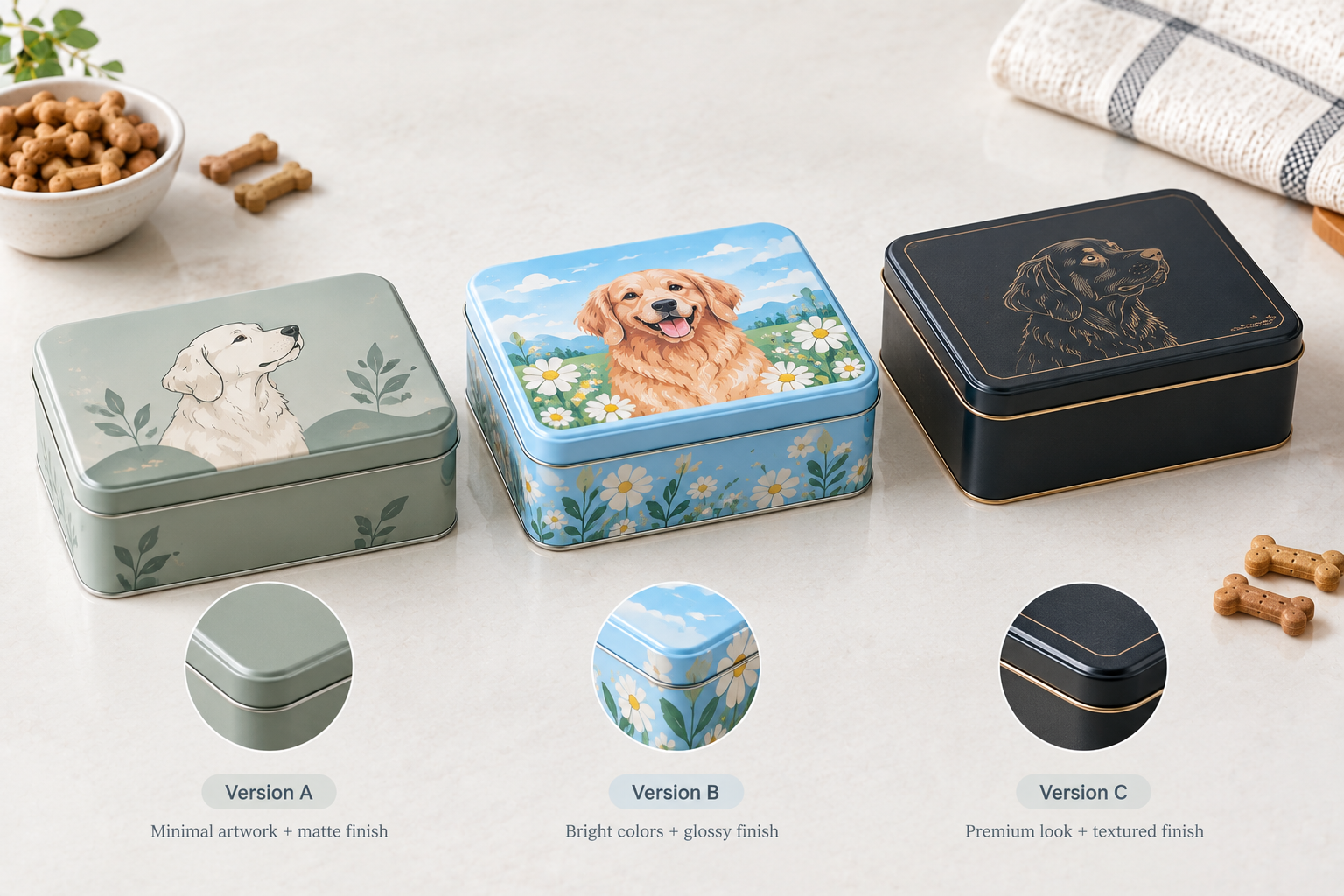
Should Every Dog Treat Tin Use the Same Artwork?
No.
A brand can create a consistent packaging family without making every product look identical.
This is particularly useful when a pet brand has several treat varieties.
Keep the core brand elements consistent:
Logo + Typography + Layout + Brand Style
Then vary product-specific elements such as:
Color + Illustration + Flavor + Product Name
This gives customers a visual connection between products while making each variety easy to identify.
It also makes future product development more manageable. A new treat can follow an existing visual system instead of requiring a completely new packaging concept.
How Can You Make Custom Dog Treat Packaging Look Premium?
Premium packaging is not necessarily about adding more design elements.
In many cases, it comes from better control of the elements already being used.
A strong design usually has:
- A clear focal point
- Consistent spacing
- Controlled color use
- Readable product information
- A recognizable brand element
- A finish that supports the design
This is particularly important for a tin because the available artwork area is limited.
If the logo, product name, illustration, pattern, claims, and decorative elements all have equal visual importance, the customer may not know where to look first.
A custom tin can feel more refined when the design deliberately leaves some elements quiet.
How Can You Avoid Overcomplicating a Custom Dog Treat Tin?
This is one of the most important decisions in custom packaging.
Once a brand realizes that a tin can be customized, it is tempting to change everything:
- Special shape
- Complex artwork
- Multiple colors
- Several finishes
- Decorative patterns
- Additional packaging components
- Extra visual effects
But more customization does not automatically create stronger packaging.
The better question is:
Does this customization improve brand recognition, product presentation, or customer experience?
If it does not, it may not be necessary.
Start With the Elements That Matter Most
For most brands, the priorities can be narrowed down to:
Brand Identity → Product Recognition → Visual Appeal → Packaging Function
Everything else should support those priorities.
For example, if the illustration is the main brand asset, there may be little reason to add a complicated tin shape that competes with it.
If the tin shape itself is intended to become part of the brand identity, the artwork may need to remain simpler.
The strongest packaging concepts usually have a clear reason behind each major design decision.
How Should You Balance Brand Identity and Product Information?
A dog treat tin still needs to communicate what the product is.
Branding should not make the package difficult to understand.
A useful visual hierarchy might look like:
Brand → Dog Treat Product → Variety / Flavor → Supporting Information
The customer should be able to identify the brand and product without studying the entire tin.
This becomes particularly important when several products from the same brand appear together.
The packaging should answer two questions quickly:
Whose product is this?
and
Which product is this?
Good customization makes those answers easier—not harder.
How Can You Keep Different Dog Treat Products Visually Consistent?
When a brand has several products, consistency becomes more important than making each tin completely unique.
You can establish a packaging system around a few fixed elements.
For example:
| Brand Element | Keep Consistent | Can Change |
|---|---|---|
| Logo | ✓ | |
| Typography | ✓ | |
| Basic layout | ✓ | |
| Brand style | ✓ | |
| Product color | ✓ | |
| Illustration | ✓ | |
| Flavor identification | ✓ | |
| Product name | ✓ |
This approach creates a recognizable product family.
It also makes future packaging development easier because new products can follow an established design framework.
When Should You Move From Branding to Printing?
Printing should come after the visual direction has been established.
First decide:
What should the package look like?
Then determine:
How should that design be reproduced on the tin?
This keeps branding decisions separate from printing-technology decisions.
For detailed information about artwork preparation, printing options, and MOQ, see our dedicated Custom Printed Tin Packaging Guide.
That article is the better reference for the technical printing side of the project, while this article focuses on the brand and visual customization decisions.
What Should You Prepare Before Designing a Custom Dog Treat Tin?
You do not need a finished artwork file before starting a packaging discussion.
A useful starting brief can include four areas.
Brand Information
- Logo
- Brand colors
- Existing brand guidelines
- Existing packaging references
Product Information
- Product name
- Treat variety
- Flavor
- Product differentiation
- Required product information
Visual Direction
- Preferred design style
- Reference images
- Illustration direction
- Color preferences
- Finish preferences
Packaging Structure
The basic tin structure should already be under discussion or confirmed.
If you are still working out the technical packaging requirements, refer to our dog treat tin size and structure guide rather than trying to solve the structural and visual decisions simultaneously.
This creates a cleaner workflow:
Product Requirements → Tin Structure → Brand Direction → Artwork → Sample → Production
What Does the Customization Process Look Like?
Once the basic tin structure has been established, the visual customization process can follow a straightforward sequence.
1. Define the Brand Direction
Identify the visual characteristics the package needs to communicate.
2. Establish the Visual System
Decide how the logo, colors, typography, illustrations, and product information should work together.
3. Develop the Artwork
Apply the visual system to the actual tin structure.
4. Review the Physical Result
Check how the design works on the actual package rather than relying only on a digital mockup.
5. Approve the Sample
Review the finished appearance and make any necessary adjustments before bulk production.
6. Move Into Production
Once the artwork and packaging specifications are approved, the project can proceed according to the agreed production requirements.
Notice that this process is intentionally focused on brand execution and visual approval. The technical size and fit decisions belong to the separate selection guide.
What About MOQ and Custom Sample Timing?
MOQ and sample timing depend on the specific customization requirements, including the selected structure, printing, finish, and production setup.
Rather than repeating the same figures across every dog treat packaging article, we recommend using the dedicated Custom Printed Tin Packaging Guide for the latest general MOQ and production-related information.
This keeps the content cluster organized:
- How to Choose a Dog Treat Tin → product fit and structure
- Custom Dog Treat Tins → branding and visual customization
- Custom Printed Tin Packaging → printing and commercial production details
For a specific project, the actual requirements should be confirmed based on the selected packaging concept.
What Experience Matters When Developing Custom Tin Packaging?
Custom packaging is not only about producing artwork.
The design also needs to work with the physical manufacturing process.
Liyipackaging has more than 25 years of experience in tin packaging manufacturing and operates a 3,000㎡ production facility, supporting projects from design and development through production and pre-shipment quality control.
That experience is useful when a brand needs to balance visual goals with practical manufacturing requirements.
For example, a design may look attractive as artwork but require adjustment once it is considered alongside the actual tin structure, artwork area, finishing, and production process.
The earlier these factors are considered together, the fewer unnecessary revisions are likely to occur.
You can learn more about our tin packaging manufacturing capabilities.
How Do You Start a Custom Dog Treat Tin Project?
The best starting point is not:
“What is the most customized tin you can make?”
A better starting point is:
“What does our brand need this tin to communicate?”
From there, decide which elements should carry the identity:
Shape → Color → Logo → Artwork → Finish
You do not need to customize every element.
A well-controlled package with a strong visual system can be more recognizable than a package filled with unnecessary features.
If you already have your product information and brand direction, you can share your dog treat packaging requirements with our team to discuss the next step.
FAQ About Custom Dog Treat Tins
Can I customize the artwork on a dog treat tin?
Yes. Artwork can be developed around your brand identity, including logos, colors, illustrations, product names, and other required visual elements.
Can I customize the shape of a dog treat tin?
Custom shapes can be considered when they support the product and brand concept. The technical structure should be established before the artwork is finalized.
Can I use different artwork for different dog treat products?
Yes. A consistent packaging system can maintain the same core brand elements while changing colors, illustrations, flavors, or product names for different products.
How can I make my dog treat tin look more premium?
Start with a clear visual hierarchy, controlled color use, appropriate artwork, and a finish that supports the brand concept. Adding more design elements does not necessarily make packaging look more premium.
Should I customize every part of the tin?
No. Customization should have a purpose. Focus first on the elements that affect brand recognition, product presentation, and customer experience.
Do I need finished artwork before contacting a tin manufacturer?
No. A logo, brand direction, product information, and visual references can be enough to start discussing the project. Final artwork can be developed after the packaging structure and artwork area are established.
Where can I find MOQ and sample information?
MOQ and sample timing can vary by project. For the general commercial and printing-related information, refer to our Custom Printed Tin Packaging Guide.